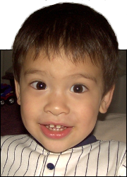
 This is Alpha, the first-born, when he was 2YO.
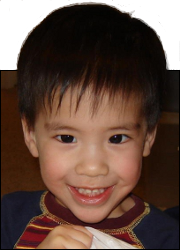 This is Beta, the second-born, when he was about 2YO.
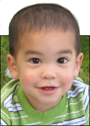 This is Gamma, the third-born, when he was about 18MO.
Bad Elevator
Sep
15
2016
Probably many people do not pay as much attention to user interfaces as I do. I wouldn’t consider myself an expert, but if I have questions when trying to use something, it makes me wonder how much thought went into the design.
Take, for instance, these elevator buttons.
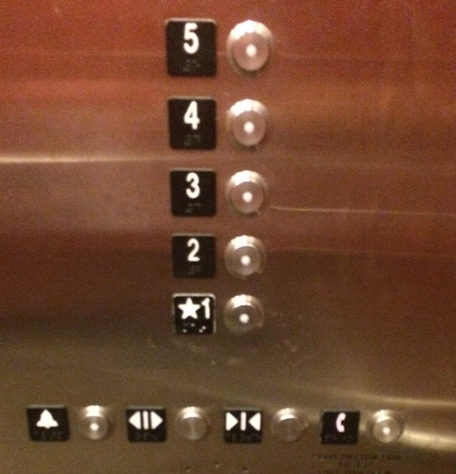
If you are in a hurry and want the doors to close, you glance down and push the button next to the Close Doors symbol (AKA >|<).
But wait! There are two buttons next to the Close Doors symbol. Which one is the correct one?
In my case, I started at the end and noted that the button is placed to the right of the symbol, then I went over to the symbol I wanted and pushed the button to the right of it.
Not a big deal if someone pushed the wrong button for Close Doors, but what if someone pushed the wrong button for the Open Doors button? That would summon the fire department.
The button layout and/or background design should make it obvious which buttons go with which symbols.
Like this (please excuse the poor editing):
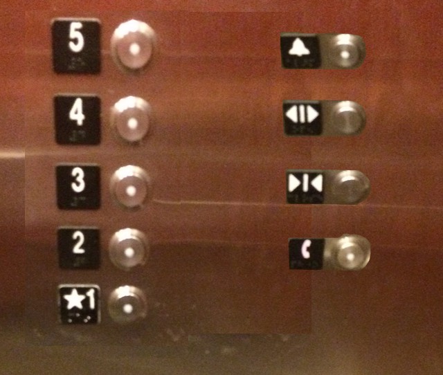
Or this (likewise):
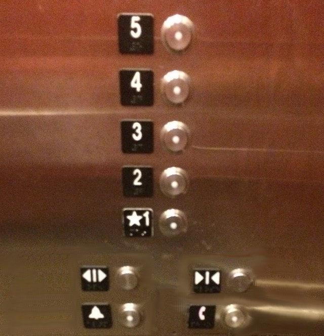
Or a different color or border or something to separate close buttons.
If they will not believe you or heed the witness of the first sign, they may believe the witness of the last sign.
Exodus 4:8


This little article thingy was written by Some Guy sometime around 6:11 am and has been carefully placed in the Mishaps category.