
 This is Alpha, the first-born, when he was 2YO.
 This is Beta, the second-born, when he was about 2YO.
 This is Gamma, the third-born, when he was about 18MO.
Consistent Interface
Oct
12
2023
One of main complaints with the iPhone is the inconsistent interface for clock notifications. I use both the alarm (for waking up in the morning) and the timer (reminders during the day) just about every day. And I never know which button to press to get it to stop.
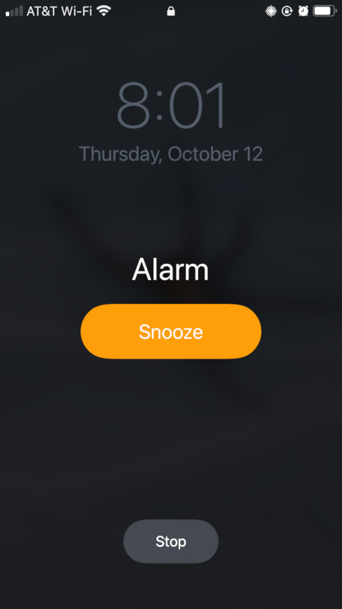
Here’s the alarm:
And here’s the timer:
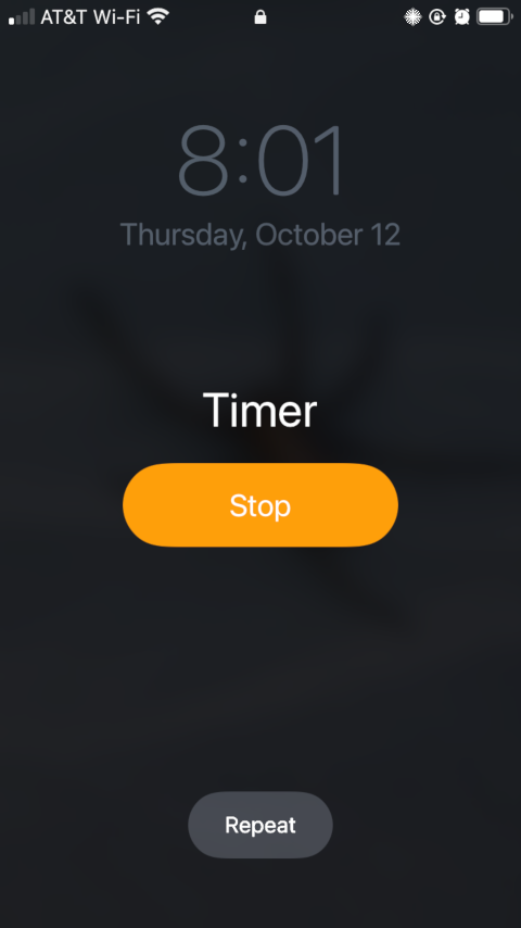
My problem is that I want to press the larger, more colorful button. But Apple has made the decision that for the two parts of its clock app, the larger, more colorful button will have two different meanings.
So when my iPhone starts making clock noises, I have to look at it, figure out which button means “stop” and which button means “remind me again soon”, and press the one I want.
One of these days, I’ll change my alarm setting to turn off the snooze option…
Then when you sound an alarm the second time, the camps that are pitched on the south side shall set out; an alarm is to be sounded for them to break camp.
Numbers 10:6